Animation

The Search for the 2x Frequency Response

The following data visualizations walk you through the process of determining if the 2x frequency response
from fish auditory brain responses is significantly above the noise floor.
Note: View in full screen in browser. Please allow 3-10 seconds for the data to load.
Loading animated waveform...
Hair Cell Orientation Figure

What is the 2x Frequency Response?

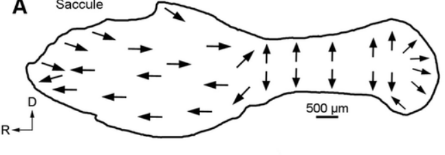
The 2x frequency response is an auditory brainwave signal observed in fish, appearing at twice the frequency of the stimulus. For example, when a 100 Hz tone is presented, a peak emerges at 200 Hz in the brain's spectral response. This occurs because fish have oppositely oriented hair cells that depolarize during both the compression and rarefaction phases of a sound wave. As a result, each cycle of the stimulus produces two depolarization events across the hair cell population.

By 200 trials, the 2x frequency response is statistically greater than the noise floor

Number of Trials Included in Average: 10
Loading waveform data...
When many trials are included, much of the noise has been averaged out. But the waveform itself does not look like there is much going on.
Loading FFT data...
As we increase the number of responses included in the average, a peak at the 2× frequency becomes distinguishable above the noise floor. However, when using alternating polarity stimuli, this response peak at the stimulus frequency itself sinks into the noise floor with continued averaging.
Loading p-value significance analysis...
Here we can see at what point the 2x frequency response amplitude is significantly greater than the noise floor. If the 2x frequency response component is significantly higher than the noise floor, we have good evidence to suggest that the subject "detected" the sound.

Alternative ways to view the trajectory of the 2x Frequency Response

Looking at the change in signal amplitude over iterative averages with dynamic scaling

By using the slider to dynamically adjust the x-axis range, as the number of trials included in the averaged waveform increases, we can simulate how the signal evolves throughout live data collection. This approach highlights the importance of collecting many trials as early patterns may can shift significantly as more data accumulates, revealing a more accurate representation of the underlying signal.

Loading metrics analysis...
Number of Trials Included in Average: 20
Loading signal analysis data...
Number of Trials Included in Average: 10

Comparing amplitudes on a logarithmic scale

The amplitude values—and their changes over time—differ substantially across the three signal types. To better visualize both the relative differences between signals and the within-signal changes over time, a logarithmic scale was applied to the y-axis. This transformation revealed the pronounced trajectory of the stimulus frequency response, in contrast to the relatively stable appearance of the 2x frequency response and the noise floor. However, using a logarithmic scale assumes that the viewer understands the compression effect it introduces on the displayed values.

A direct comparison of SNR and Waveform Morphology

The hover function enables quick visual comparison between waveform shapes and their associated signal-to-noise ratios (SNRs) for the 2x frequency response and noise floor amplitudes. In general, waveforms averaged over more trials exhibit lower noise floor amplitudes. This is visually apparent, as these waveforms have smaller overall amplitudes compared to those averaged over fewer trials.

Loading linked hover visualization...

A4 Information

Name: Finding the AEP
Team Member: Aoi Hunsaker
Dataset: From my lab (Sisneros Laboratory)
Repository
CSE 512
University of Washington